css3实现闪亮进度条效果
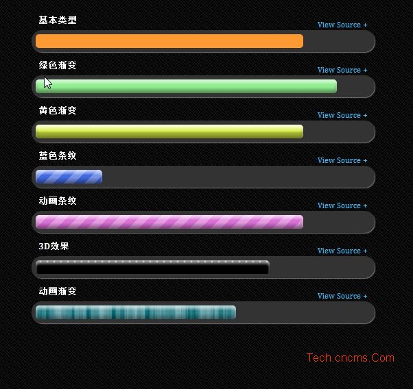
style.css:.holder{position:relative;margin-bottom:10px;}.content-inner{width:500px;margin:0 auto;}.content-inner h3{color:#fff;margin:0 10px;}.content-inner .source.wide{width:1000px;margin-left:-250px;}.content-inner .source.medium{width:650px;margin-left:-75px;}.content-inner .source span{position:absolute;top:7px;right:10px;color:#35BFFF;font-size:12px;cursor:pointer;}.content-inner .source span:after{content:' + ';}.content-inner .source span.active{color:#666;}.content-inner .source span.active:after{content:' - ';}.content-inner .source pre{color:#ccc;background:#000;border:1px solid #333;padding:7px 15px;box-shadow:0 0 7px #333;}.content-inner .source pre hr{border:none;border-bottom:1px dashed #333;} .bar{margin:5px 0 3px;border:6px solid #333;background:#333;overflow:hidden;border-radius:50px;-moz-border-radius:50px;-webkit-border-radius:50px;box-shadow:1px 1px 1px #777;-moz-box-shadow:1px 1px 1px #777;-webkit-box-shadow:1px 1px 1px #777;}.bar > span{display:block;height:20px;width:20%;border-radius:5px;-moz-border-radius:5px;-webkit-border-radius:5px;}.gradient > span{box-shadow:0 5px 5px rgba(255,255,255,0.6) inset, 0 -5px 7px rgba(0, 0, 0, 0.4) inset;-moz-box-shadow:0 5px 5px rgba(255,255,255,0.6) inset, 0 -5px 7px rgba(0, 0, 0, 0.4) inset;-webkit-box-shadow:0 5px 5px rgba(255,255,255,0.6) inset, 0 -5px 7px rgba(0, 0, 0, 0.4) inset;filter: progid:DXImageTransform.Microsoft.gradient( startColorstr='#33ffffff', endColorstr='#33000000',GradientType=0 );}.gloss > span{background-image: -moz-linear-gradient(top, rgba(255,255,255,0.2) 0%, rgba(255,255,255,0.1) 45%, rgba(0,0,0,0.2) 55%, rgba(0,0,0,0.1) 100%);background-image: -webkit-gradient(linear, left top, left bottom, color-stop(0%,rgba(255,255,255,0.2)), color-stop(45%,rgba(255,255,255,0.1)), color-stop(55%,rgba(0,0,0,0.2)), color-stop(100%,rgba(0,0,0,0.1)));background-image: -webkit-linear-gradient(top, rgba(255,255,255,0.5) 0%, rgba(255,255,255,0.1) 45%, rgba(0,0,0,0.2) 55%, rgba(0,0,0,0.1) 100%);background-image: -o-linear-gradient(top, rgba(255,255,255,0.2) 0%, rgba(255,255,255,0.1) 45%, rgba(0,0,0,0.2) 55%, rgba(0,0,0,0.1) 100%);background-image: -ms-linear-gradient(top, rgba(255,255,255,0.2) 0%, rgba(255,255,255,0.1) 45%, rgba(0,0,0,0.2) 55%, rgba(0,0,0,0.1) 100%);background-image: linear-gradient(to bottom, rgba(255,255,255,0.2) 0%, rgba(255,255,255,0.1) 45%, rgba(0,0,0,0.2) 55%, rgba(0,0,0,0.1) 100%);}.stripe > span{background-size:30px 30px;-moz-background-size:30px 30px;-webkit-background-size:30px 30px;-o-background-size:30px 30px;background-image: -moz-linear-gradient(-45deg, rgba(255,255,255,0.15) 0%, rgba(255,255,255,0.15) 25%, rgba(255,255,255,0) 25%, rgba(255,255,255,0) 50%, rgba(255,255,255,0.15) 50%, rgba(255,255,255,0.15) 75%, rgba(255,255,255,0) 75%, rgba(255,255,255,0) 100%);background-image: -webkit-gradient(linear, left top, right bottom, color-stop(0%,rgba(255,255,255,0.2)), color-stop(25%,rgba(255,255,255,0.2)), color-stop(25%,rgba(255,255,255,0)), color-stop(50%,rgba(255,255,255,0)), color-stop(50%,rgba(255,255,255,0.2)), color-stop(75%,rgba(255,255,255,0.2)),color-stop(75%,rgba(255,255,255,0)),color-stop(100%,rgba(255,255,255,0)));background-image: -webkit-linear-gradient(-45deg, rgba(255,255,255,0.3) 0%,rgba(255,255,255,0.3) 25%,rgba(255,255,255,0) 25%,rgba(255,255,255,0) 50%,rgba(255,255,255,0.3) 50%,rgba(255,255,255,0.3) 75%,rgba(255,255,255,0) 75%,rgba(255,255,255,0) 100%);background-image: -o-linear-gradient(-45deg, rgba(255,255,255,0.15) 0%,rgba(255,255,255,0.15) 25%,rgba(255,255,255,0) 25%,rgba(255,255,255,0) 50%,rgba(255,255,255,0.15) 50%,rgba(255,255,255,0.15) 75%,rgba(255,255,255,0) 75%,rgba(255,255,255,0) 100%);background-image: -ms-linear-gradient(-45deg, rgba(255,255,255,0.15) 0%,rgba(255,255,255,0.15) 25%,rgba(255,255,255,0) 25%,rgba(255,255,255,0) 50%,rgba(255,255,255,0.15) 50%,rgba(255,255,255,0.15) 75%,rgba(255,255,255,0) 75%,rgba(255,255,255,0) 100%);background-image: linear-gradient(135deg, rgba(255,255,255,0.15) 0%,rgba(255,255,255,0.15) 25%,rgba(255,255,255,0) 25%,rgba(255,255,255,0) 50%,rgba(255,255,255,0.15) 50%,rgba(255,255,255,0.15) 75%,rgba(255,255,255,0) 75%,rgba(255,255,255,0) 100%);}.pattern > span{background-size: 13px, 29px, 37px, 53px;background-image: -moz-linear-gradient(left, rgba(255,255,255,0.07) 0%, rgba(255,255,255,0.07) 50%, transparent 50%),-moz-linear-gradient(left, rgba(255,255,255,0.13) 0%, rgba(255,255,255,0.13) 50%, transparent 50%),-moz-linear-gradient(left, transparent 0%, transparent 50%, rgba(255,255,255,0.17) 50%),-moz-linear-gradient(left, transparent 0%, transparent 50%, rgba(255,255,255,0.19) 50%);background-image: -webkit-linear-gradient(left, rgba(255,255,255,0.07) 0%, rgba(255,255,255,0.07) 50%, transparent 50%),-webkit-linear-gradient(left, rgba(255,255,255,0.13) 0%, rgba(255,255,255,0.13) 50%, transparent 50%),-webkit-linear-gradient(left, transparent 0%, transparent 50%, rgba(255,255,255,0.17) 50%),-webkit-linear-gradient(left, transparent 0%, transparent 50%, rgba(255,255,255,0.19) 50%);background-image: -webkit-gradient(linear, left top, right top, color-stop(0%,rgba(255,255,255,.07)), color-stop(50%,rgba(255,255,255,.07)), color-stop(50%,rgba(255,255,255,0)),color-stop(50%,rgba(255,255,255,0))),-webkit-gradient(linear, left top, right top, color-stop(0%,rgba(255,255,255,.13)), color-stop(50%,rgba(255,255,255,.13)), color-stop(50%,rgba(255,255,255,0)),color-stop(50%,rgba(255,255,255,0))),-webkit-gradient(linear, left top, right top, color-stop(0%,rgba(255,255,255,0)), color-stop(50%,rgba(255,255,255,0)), color-stop(50%,rgba(255,255,255,0.17)),color-stop(50%,rgba(255,255,255,0.17))),-webkit-gradient(linear, left top, right top, color-stop(0%,rgba(255,255,255,0)), color-stop(50%,rgba(255,255,255,0)), color-stop(50%,rgba(255,255,255,0.19)),color-stop(50%,rgba(255,255,255,0.19)));background-image: -o-linear-gradient(left, rgba(255,255,255,0.07) 0%, rgba(255,255,255,0.07) 50%, transparent 50%),-o-linear-gradient(left, rgba(255,255,255,0.13) 0%, rgba(255,255,255,0.13) 50%, transparent 50%),-o-linear-gradient(left, transparent 0%, transparent 50%, rgba(255,255,255,0.17) 50%),-o-linear-gradient(left, transparent 0%, transparent 50%, rgba(255,255,255,0.19) 50%);background-image: -ms-linear-gradient(left, rgba(255,255,255,0.07) 0%, rgba(255,255,255,0.07) 50%, transparent 50%),-ms-linear-gradient(left, rgba(255,255,255,0.13) 0%, rgba(255,255,255,0.13) 50%, transparent 50%),-ms-linear-gradient(left, transparent 0%, transparent 50%, rgba(255,255,255,0.17) 50%),-ms-linear-gradient(left, transparent 0%, transparent 50%, rgba(255,255,255,0.19) 50%);background-image: linear-gradient(to right, rgba(255,255,255,0.07) 0%, rgba(255,255,255,0.07) 50%, transparent 50%),linear-gradient(to right, rgba(255,255,255,0.13) 0%, rgba(255,255,255,0.13) 50%, transparent 50%),linear-gradient(to right, transparent 0%, transparent 50%, rgba(255,255,255,0.17) 50%),linear-gradient(to right, transparent 0%, transparent 50%, rgba(255,255,255,0.19) 50%);}.pattern > span > span{display:block;height:100%;width:100%;border-radius:5px;-moz-border-radius:5px;-webkit-border-radius:5px;background-size: 12px;background-image: -moz-linear-gradient(left, rgba(255,255,255,0.1) 0%, rgba(255,255,255,0.1) 50%, transparent 50%);background-image: -webkit-gradient(linear, left top, right top, color-stop(0%,rgba(255,255,255,0.1)), color-stop(50%,rgba(255,255,255,0.1)), color-stop(50%,rgba(255,255,255,0)));background-image: -webkit-linear-gradient(left, rgba(255,255,255,0.1) 0%, rgba(255,255,255,0.1) 50%, transparent 50%);background-image: -o-linear-gradient(left, rgba(255,255,255,0.1) 0%, rgba(255,255,255,0.1) 50%, transparent 50%);background-image: -ms-linear-gradient(left, rgba(255,255,255,0.1) 0%, rgba(255,255,255,0.1) 50%, transparent 50%);background-image: linear-gradient(to right, rgba(255,255,255,0.1) 0%, rgba(255,255,255,0.1) 50%, transparent 50%);}.pattern2 > span{background-size: 10px 60px; background-position: 0;background-image: -moz-radial-gradient(center, ellipse cover, rgba(255,255,255,.9) 0%,rgba(255,255,255,.2) 20%,transparent 40%);background-image: -webkit-gradient( radial, center center, 0, center center, 60, color-stop(0, rgba(255,255,255,.9)), color-stop(20%, rgba(255,255,255,.2)), color-stop(40%, rgba(255,255,255,0)),color-stop(100%, rgba(255,255,255,0)));background-image: -webkit-radial-gradient(center, ellipse cover, rgba(255,255,255,.9) 0%,rgba(255,255,255,.2) 20%,transparent 40%);background-image: -o-radial-gradient(center, ellipse cover, rgba(255,255,255,.9) 0%,rgba(255,255,255,.2) 20%,transparent 40%);background-image: -ms-radial-gradient(center, ellipse cover, rgba(255,255,255,.9) 0%,rgba(255,255,255,.2) 20%,transparent 40%);background-image: radial-gradient(ellipse at center, rgba(255,255,255,.9) 0%,rgba(255,255,255,.2) 20%,transparent 40%);}.bar.color0 > span{background-color:#FF9932;}.bar.color1 > span{background-color:#90EE90;}.bar.color2 > span{background-color:#dbf043;}.bar.color3 > span{background-color:#4169E1;}.bar.color4 > span{background-color:#DA70D6;}.bar.color5 > span{background-color:#000;}.bar.color6 > span{background-color:#026873;}.animate{animation:progress 2s linear infinite;-moz-animation:progress 2s linear infinite;-webkit-animation:progress 2s linear infinite;-ms-animation:progress 2s linear infinite;-o-animation:progress 2s linear infinite;}@-webkit-keyframes progress { from { background-position: 0 0; } to { background-position: -60px -60px; }}@-moz-keyframes progress { from { background-position: 0 0; } to { background-position: -60px -60px; }}@-ms-keyframes progress { from { background-position: 0 0; } to { background-position: -60px -60px; }}@-o-keyframes progress { from { background-position: 0 0; } to { background-position: -60px -60px; }}@keyframes progress { from { background-position: 0 0; } to { background-position: -60px -60px; }}vendor.css:body{font-family:Cambria, Georgia, serif;line-height:1.6em;font-size:100%;background:url(bg.png) 0 0 repeat;margin:0;padding:0;}header, section, footer, nav, hgroup{display:block;}a{color:#35BFFF;text-decoration:none;transition:all 1s;-moz-transition:all 1s;-webkit-transition:all 1s;-ms-transition:all 1s;-o-transition:all 1s;}a:hover, a:active{color:#91DCFF;}img{max-width:100%;}a img{border:none;}/* Header */#header{width:100%;background:#000;background:rgba(0, 0, 0, 0.8);color:#ccc;letter-spacing:1px;margin-bottom:20px;padding:3px 0;position:relative;box-shadow:0 3px 10px #333;-moz-box-shadow:0 3px 10px #333;-webkit-box-shadow:0 3px 10px #333;top:0;left:0;z-index:99;}#header h1{padding:0 20px;margin:10px 0;text-shadow:1px 1px 0 #FFF, 2px 1px 1px #CCC;float:left;}#backlinks{float:right;padding:5px 20px;line-height:1.6em;font-weight:bold;font-size:11px;font-family:'arial narrow', arial;}#backlinks a{text-align:right;display:block;}/* Footer */#footer{position:relative;bottom:0;left:0;padding-left:20px;line-height:25px;color:#888;font-size:13px;background:rgb(0, 0, 0);background:rgba(0, 0, 0, 0.8);box-shadow:0 -3px 10px #333;-moz-box-shadow:0 -3px 10px #333;-webkit-box-shadow:0 -3px 10px #333;z-index:99;}#footer span{display:inline-block;}/* content header */#wrapper{position:relative;margin:3em auto;}#wrapper h2{margin:0;color:#0082E0;text-shadow:1px 1px 1px #777;font-size:33px;font-family:Arial Narrow, Arial, sans-serif;}#wrapper h2 span{color:#56B8FF;}#wrapper hgroup h3{font-style:italic;font-weight:normal;font-size:18px;text-shadow:0 1px 0 #fafafa;color:#444;margin:0;}.description{font-style:italic;font-size:15px;color:#aaa;}#ad-holder{position:absolute;top:-40px;right:10px;}#ad-holder div{text-align:right;}#ad-holder a{color:#ccc;font-size:15px;font-style:italic;padding-left:10px;}/* clearfix */.clearfix {clear:both;}本文网址:https://www.dedexuexi.com/divcss/jc/2224.html
本站部分文章搜集与网络,如有侵权请联系本站,转载请说明出处。
标签:技巧