CSS3实现的闪烁跳跃进度条示例
原理是通过大量的css3属性来实现的,如:animation、transform、keyframes等等属性,示例采用了结构性伪类选择符E:nth-child(n),来进行对HTML元素的选择以及控制输出,感兴趣的朋友可以了解下
这个示例的原理是通过大量的css3属性来实现的,如:animation、transform、keyframes等等属性。值得注意的是这个示例采用 了结构性伪类选择符E:nth-child(n),来进行对HTML元素的选择以及控制输出。相信这个伪类选择符在将来会是一个很强大的一个工具。推荐大 家多多了解以及实践使用。这个伪类选择符E:nth-child(n)的含义是匹配父元素的第n个子元素E。 例如:ul li:nth-child(3)表示的是选择<ul>元素里面的第3个<li>。提示一下,该属性在IE8(包含IE8)版本以 下是不支持的。
建议开发童鞋使用跨平台开发工具——统一开发环境UDE来 进行查看、调试、开发哦~~它是一款HTML5跨平台一站式应用开发、调试和部署工具, 支持HTML5跨平台开发,原Java跨平台插件支持Android/Symbian/Kjava的跨平台和原生开发,为开发者提供丰富的应用模板、示例 代码及开发者社区服务,已覆盖Android、iOS、WP、Symbian、Kjava操作系统平台。
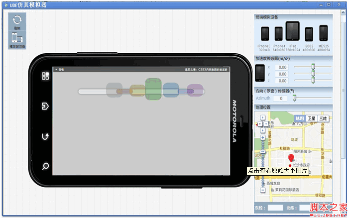
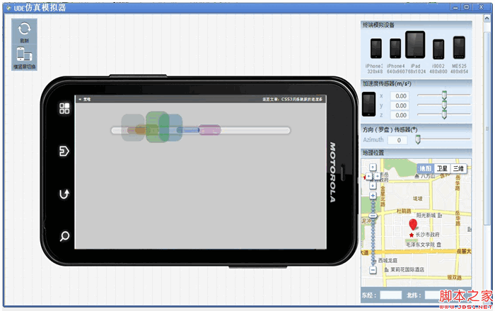
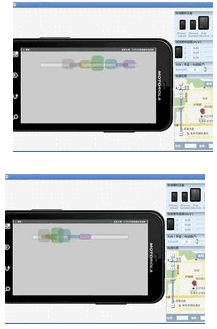
UDE模拟器调试效果图:
下面就一起来看看该示例的实现代码吧。完整代码下载请见附件。
HTML结构代码
代码如下:
<div class="center">
<ul>
<li>
<div></div>
</li>
<li>
<div></div>
</li>
<li>
<div></div>
</li>
<li>
<div></div>
</li>
<li>
<div></div>
</li>
<li>
<div></div>
</li>
<li>
<div></div>
</li>
</ul>
</div>
CSS样式代码
代码如下:
@keyframes bump {
0% {
opacity: 0;
left: 535px;
}
100% {
left: -10px;
opacity: 0;
}
10%, 85% {
opacity: 1;
}
}
@keyframes spin {
0%, 100% {
height: 20px;
top: 50px;
}
50% {
height: 100px;
top: 0;
}
}
body {
background: rgba(0, 0, 0, 0.2);
}
div.center {
text-align: center;
margin-top: 40px;
}
ul {
background-color: rgba(255, 255, 255, 0.4);
position: relative;
display: block;
padding: 0;
margin: auto;
width: 600px;
height: 10px;
list-style: none;
border-radius: 200px;
border: 5px solid rgba(255, 255, 255, 0.2);
margin-top: 100px;
box-shadow: 0 0 5px 5px rgba(0, 0, 0, 0.1);
}
ul li {
position: absolute;
margin-top: -55px;
}
ul li:nth-child(1) {
animation: bump 1.5s infinite;
animation-delay: 0.1s;
}
ul li:nth-child(1) div {
border-radius: 22px;
transform-origin: center;
position: absolute;
height: 60px;
width: 80px;
animation: spin 0.4s infinite;
animation-delay: 0.1s;
background-color: rgba(120, 120, 120, 0.3);
}
ul li:nth-child(2) {
animation: bump 1.5s infinite;
animation-delay: 0.2s;
}
ul li:nth-child(2) div {
border-radius: 22px;
transform-origin: center;
position: absolute;
height: 60px;
width: 80px;
animation: spin 0.4s infinite;
animation-delay: 0.2s;
background-color: rgba(120, 0, 0, 0.3);
}
ul li:nth-child(3) {
animation: bump 1.5s infinite;
animation-delay: 0.3s;
}
ul li:nth-child(3) div {
border-radius: 22px;
transform-origin: center;
position: absolute;
height: 60px;
width: 80px;
animation: spin 0.4s infinite;
animation-delay: 0.3s;
background-color: rgba(120, 120, 0, 0.3);
}
ul li:nth-child(4) {
animation: bump 1.5s infinite;
animation-delay: 0.4s;
}
ul li:nth-child(4) div {
border-radius: 22px;
transform-origin: center;
position: absolute;
height: 60px;
width: 80px;
animation: spin 0.4s infinite;
animation-delay: 0.4s;
background-color: rgba(0, 120, 0, 0.3);
}
ul li:nth-child(5) {
animation: bump 1.5s infinite;
animation-delay: 0.5s;
}
ul li:nth-child(5) div {
border-radius: 22px;
transform-origin: center;
position: absolute;
height: 60px;
width: 80px;
animation: spin 0.4s infinite;
animation-delay: 0.5s;
background-color: rgba(0, 120, 120, 0.3);
}
ul li:nth-child(6) {
animation: bump 1.5s infinite;
animation-delay: 0.6s;
}
ul li:nth-child(6) div {
border-radius: 22px;
transform-origin: center;
position: absolute;
height: 60px;
width: 80px;
animation: spin 0.4s infinite;
animation-delay: 0.6s;
background-color: rgba(0, 0, 120, 0.3);
}
ul li:nth-child(7) {
animation: bump 1.5s infinite;
animation-delay: 0.7s;
}
ul li:nth-child(7) div {
border-radius: 22px;
transform-origin: center;
position: absolute;
height: 60px;
width: 80px;
animation: spin 0.4s infinite;
animation-delay: 0.7s;
background-color: rgba(120, 0, 120, 0.3);
}
注:请自行在所需之处加上浏览器前缀(如:-webkit- 、 -moz-),否则将不能正常显示效果。
源码下载请见附件
本文网址:https://www.dedexuexi.com/divcss/bj/1968.html
本站部分文章搜集与网络,如有侵权请联系本站,转载请说明出处。