CSS 面包屑导航栏2个例子
方法一,
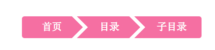
说明:本方法使用CSS3,无图片,兼容各种webkit系浏览器,同时兼容IE8+。先上图:
1.首先是HTML代码,比较简单,只需要一个简单的ul和li即可
代码如下
<div id="crumbs">
<ul>
<li><a href="#">首页</a></li>
<li><a href="#">目录</a></li>
<li><a href="#">子目录</a></li>
</ul>
<div class="fixed"></div>
</div>
2.接下来是CSS代码,首先是设定常规的li浮动和a标签美化:
代码如下
#crumbs ul li {
float: left;
list-style: none;
}
#crumbs ul li a {
display: block;
float: left;
height: 34px;
background: #f66fa2;
text-align: center;
padding: 10px 20px 0 45px;
position: relative;
margin: 0 10px 0 0;
font-size: 20px;
text-decoration: none;
color: #fff;
}
接下来就是面包屑导航的关键地方,通过before和after来创建箭头效果:
代码如下
#crumbs ul li a:after {
content: "";
border-top: 22px solid transparent;
border-bottom: 22px solid transparent;
border-left: 22px solid #f66fa2;
position: absolute; right: -22px; top: 0;
z-index: 1;
}
#crumbs ul li a:before {
content: "";
border-top: 22px solid transparent;
border-bottom: 22px solid transparent;
border-left: 22px solid #fff;
position: absolute; left: 0; top: 0;
}
#crumbs ul li:first-child a {
border-top-left-radius: 5px;
border-bottom-left-radius: 5px;
padding-left: 40px;
}
#crumbs ul li:first-child a:before {
display: none;
}
#crumbs ul li:last-child a {
padding-right: 30px;
border-top-right-radius: 5px;
border-bottom-right-radius: 5px;
}
#crumbs ul li:last-child a:after {
display: none;
}
#crumbs ul li a:hover {
background: #e56592;
transition: all 0.2s ease;
}
#crumbs ul li a:hover:after {
border-left-color: #e56592;
transition: all 0.2s ease;
}
最后清除浮动:
代码如下
.fixed {
clear: both;
}
方法二
代码如下<!DOCTYPE html PUBLIC "-//W3C//DTD XHTML 1.0 Transitional//EN" "http://www.w3.org/TR/xhtml1/DTD/xhtml1-transitional.dtd">
<html xmlns="http://www.w3.org/1999/xhtml">
<head>
<meta http-equiv="Content-Type" content="text/html; charset="utf-8″ />
<title>纯css制作面包屑,兼容IE6</title>
<style type="text/css">
*{margin:0;padding:0;list-style-type:none;}
a,img{border:0;}
body{font:12px/180% Arial, Helvetica, sans-serif, "新宋体";}
/* demo */
.demo{width:600px;margin:100px auto;background:#f0f0f0;position:relative;}
.demo ul{height:32px;overflow:hidden;}
.demo li{float:left;width:200px;text-align:center;position:relative;z-index:2;font-weight:bold;font-size:14px;line-height:32px;}
.demo li em{position:absolute;right:-24px;top:-8px;width:0;height:0;line-height:0;border-width:24px 0 24px 24px;border-color:transparent transparent transparent #fff;border-style:dashed dashed dashed solid;}
.demo li i{position:absolute;right:-16px;top:0;width:0;height:0;line-height:0;border-width:16px 0 16px 16px;border-color:transparent transparent transparent #f0f0f0;border-style:dashed dashed dashed solid;}
.demo li.current{background:#f60;color:#fff;z-index:1;}
.demo li.current i{border-color:transparent transparent transparent #f60;}
</style>
</head>
<body>
<div class="demo">
<ul class="clearfix">
<li>面包屑一<em></em><i></i></li>
<li class="current">面包屑二<em></em><i></i></li>
<li>面包屑二<em></em><i></i></li>
</ul>
</div>
</body>
</html>
本文网址:https://www.dedexuexi.com/divcss/bj/1860.html
本站部分文章搜集与网络,如有侵权请联系本站,转载请说明出处。